

literallycatie came out of a project where i was focusing on myself. who i was as a person and designer. i have always been a very literal person, so naturally, literally was important to include. and well my name too. i applied it across a few applications and it also contains the important things to me and the things that have shaped me to the person who i am today.


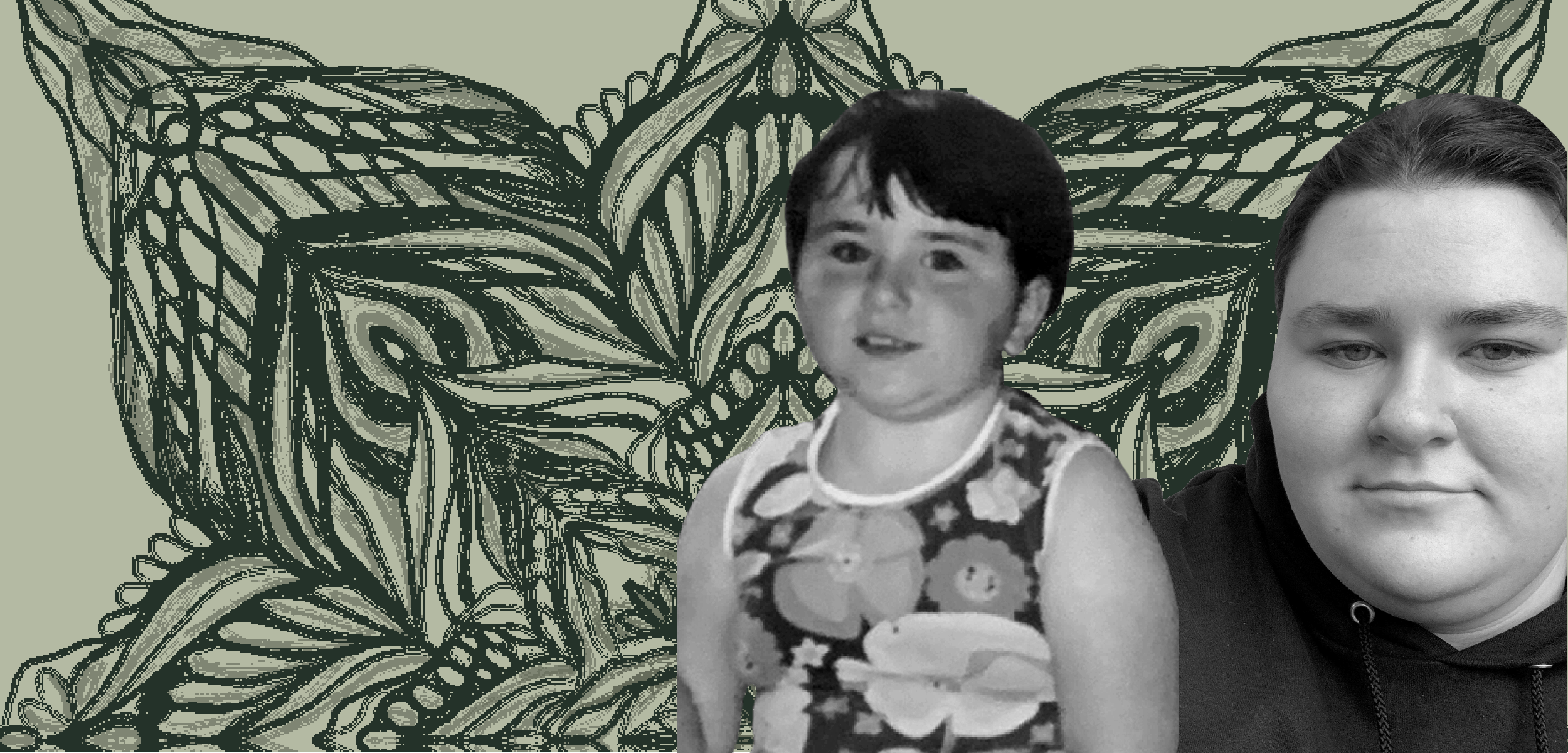
the original door poster, includes a picture of a 4 year-old me. it was a family vacation and i was out at a pottery place with my cousins. naturally i was a natural born artistic person. it has depictions of childhood camp. the text uses typeface of my favorite childhood author. all very personal and intimate details of the things that i love and have made me, well me.


and todays design,

today’s branding uses Bodoni in a capitalized short form. I also use multiple shades of green. I feel this represents the formality of the person i am. very uniform and somewhat rigid.

![business card v1 [Recovered]-01.png](https://images.squarespace-cdn.com/content/v1/642add3c77440a2e2879d69a/6ff6d2f7-750a-4929-85b5-b1aecd3e2311/business+card+v1+%5BRecovered%5D-01.png)
![business card v1 [Recovered]-02.png](https://images.squarespace-cdn.com/content/v1/642add3c77440a2e2879d69a/bb430531-39c7-4f90-9475-5217fc09b59f/business+card+v1+%5BRecovered%5D-02.png)
